Bird in the Hand Playing Cards
Client: Underdog Games
Work: Graphic design, vector illustration, product design
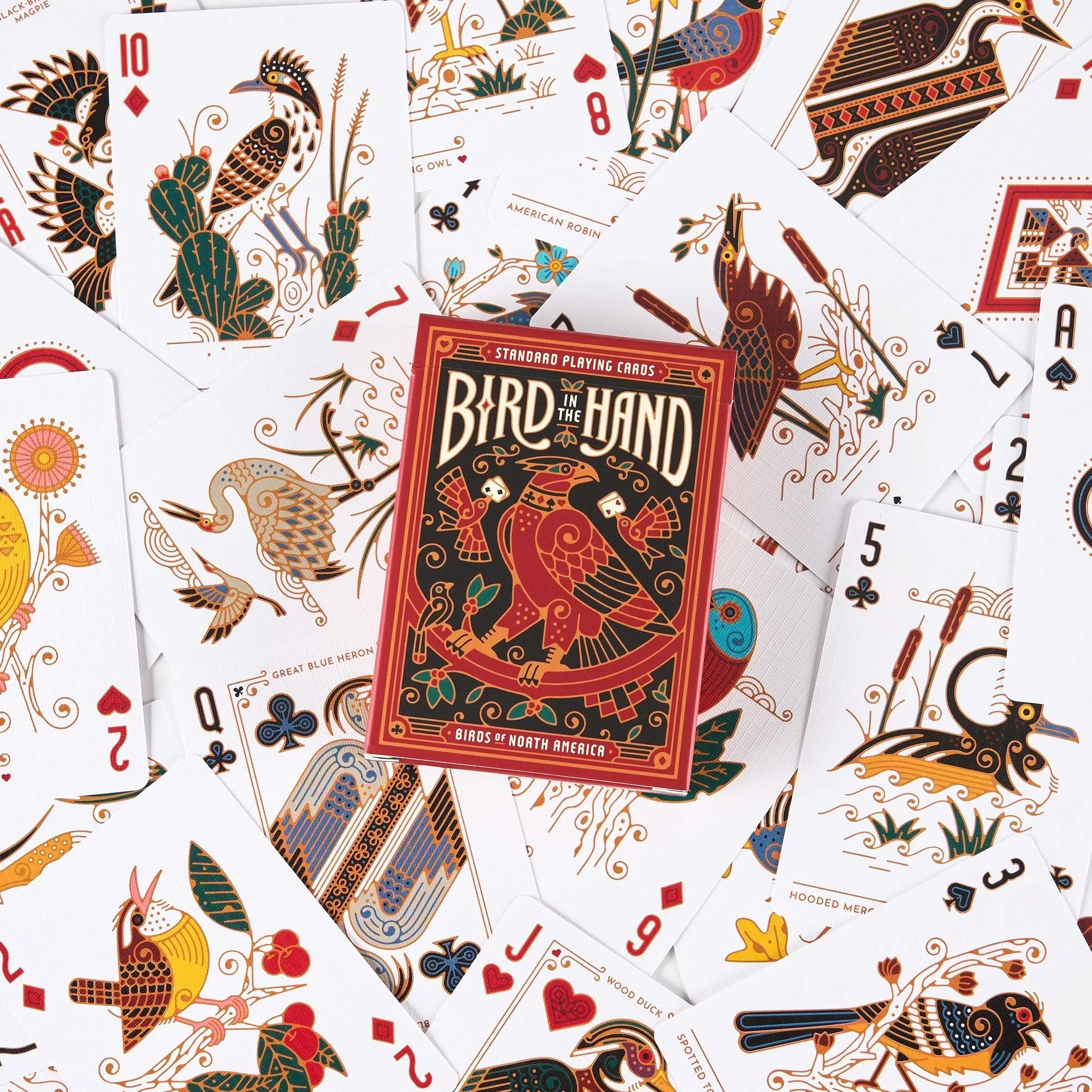
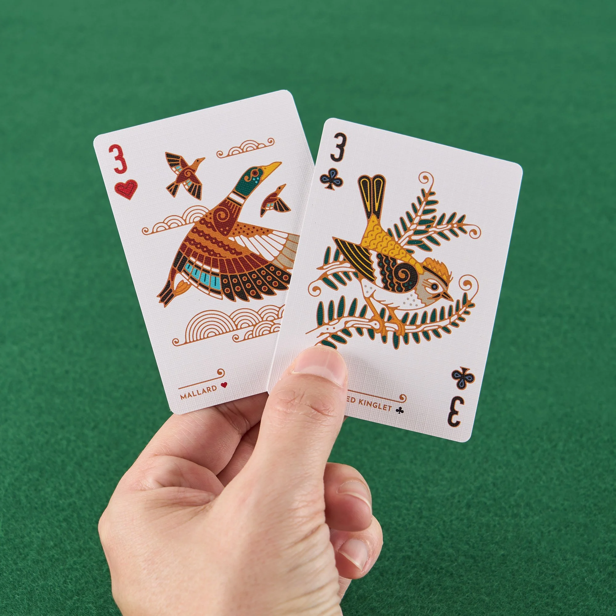
In collaboration with Underdog Games, I developed a playing card deck of North American birds. Aiming to give each species its due with a full custom illustration on all 54 cards in the deck, these birds are familiar and recognizable with a bit of flair. Birders can appreciate their behaviors depicted in the illustrations, while those who couldn’t tell the difference between a crow and a grackle are hopefully drawn to learn more about what makes these animals that surround us so special.
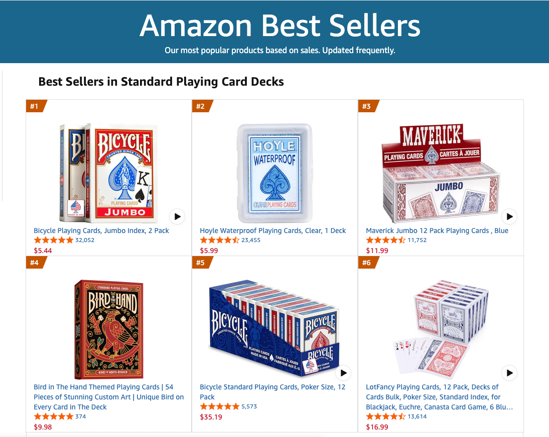
The deck was an instant success, getting millions of views on social media and selling out of its first run within days on both Amazon and Bird Collective, quickly reaching the top of Best Selling Decks sold on Amazon. Read on for a peek under the hood of how the whole nest was built.

Step 1 – Pick Your Birds
Perhaps the most difficult challenge of the project came right from the start – choosing which 54 birds to include in the deck. Everyone has a favorite, but they can’t all be included! We wanted to maintain a good balance of common birds you can find in your backyard and some of the crazier species from around North America.
Initially we toyed with giving each suit a theme (shorebirds, birds of prey, etc.), but it proved to be too tricky to manage. Instead I tried to give the face and other special cards to some of the more iconic species, like the Bald Eagle and Kingfisher (a unique bird in that the female has more colorful markings, yas Queen, you’re a King!), while the lower ranked cards would be more common. And I had to give my favorite bird, the Scissor-Tailed Flycatcher, the Ace of Spades.
After the species list was finalized, it was time to compile hundreds of reference photos. Many of these birds I was drawing for the first time, and it was important to capture their essence and all of their unique evolutionary traits in the rendering.
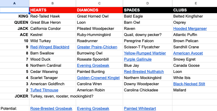
Everything was laid out in a simple, ever-evolving spreadsheet as we nailed down the final species list.


Step 2 – Sketch Away
With the species list decided, it was time to settle in on a style of illustration. Lots of inspiration was taken from art deco and mid-century styles, with gold/copper outlines and spirally flourishes.
Since we knew each card would feature a full-page illustration and not just repeated suit icons, I played around with many different layouts – if there would be a border on each card, how I could incorporate little bird motifs into suit icons, and even if each card should be mirrored like a face card.
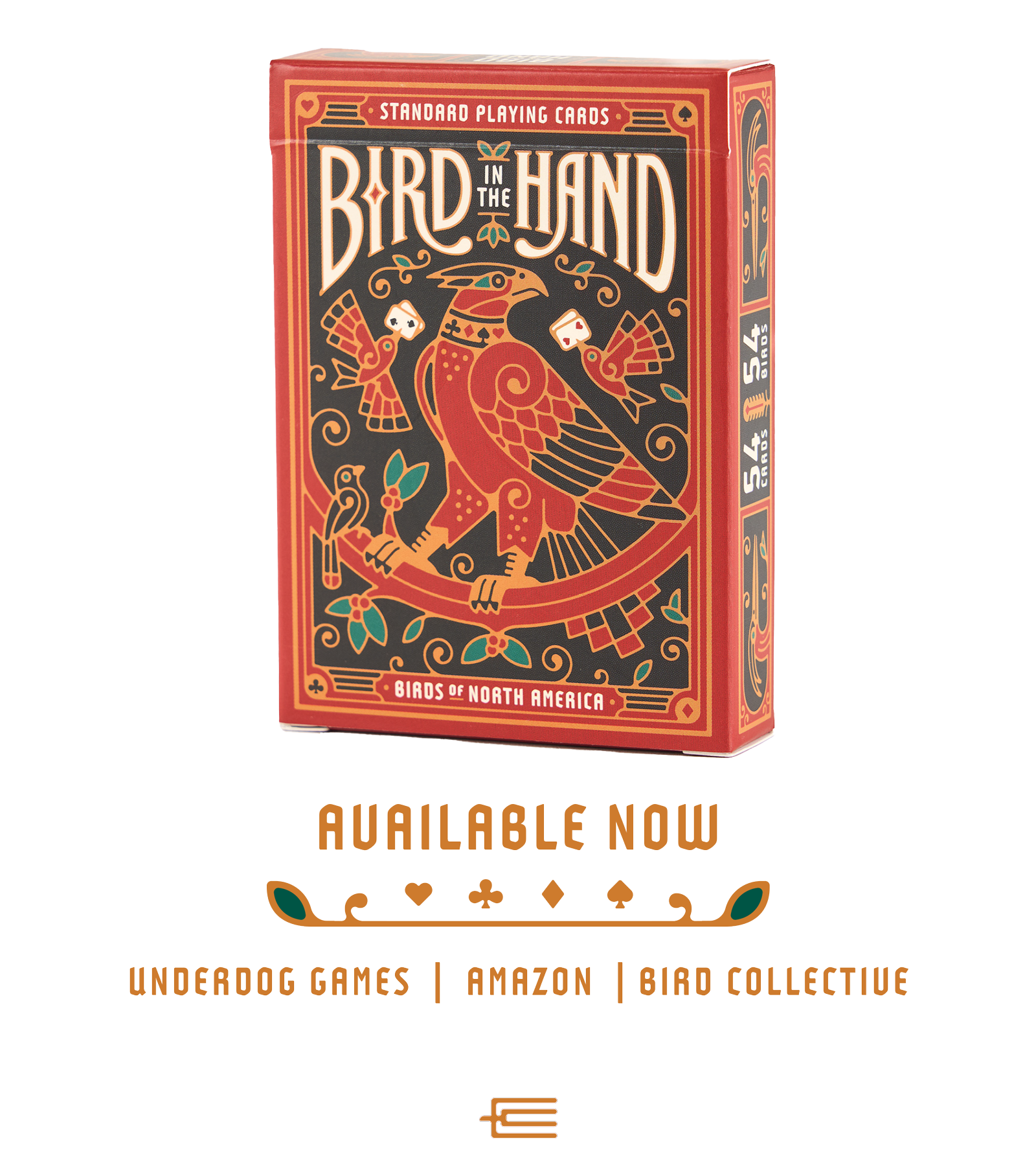
The tuckbox was a key part of the project. This is what people will see first, both in online storefronts and when they first open the deck up to play.
We came up with several options for the name of the deck, like The Flock, The Cage, or simply Birds, but eventually settled on the tongue-in-cheek idiom Bird in the Hand. Again I wanted the design to be detailed and resemble a standard Bicycle deck, but with my own style infused, keeping the hierarchy and balance of everything top of mind as we cram in as much information as possible.

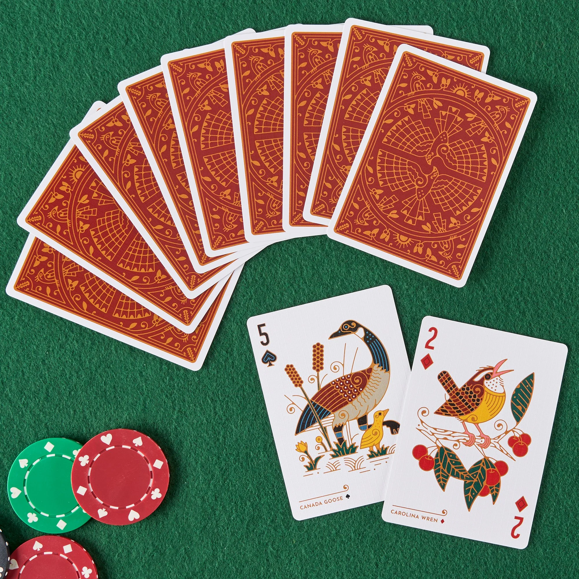
Perhaps just as important was the back of the card. This is the design people see most often, when the cards are faced down. This proved to be a difficult challenge to pair with the detailed and colorful illustrations on each card’s face – wanting the back to be intricate and interesting while not overwhelming and distracting. Eventually we opted for a symmetrical design of non-specific birds in two-colors.
Drawing the birds themselves was the only thing that remained. What I really tried to do with each bird is showcase them and their behaviors so that even non-birders could go, “oh that’s cool, I’d like to see that in real life!” The Aces especially were a fun challenge, trying to perfectly fit the design inside the shapes of the suit icons, like a hummingbird spreading its wings into a heart. Each card in the deck started with a rough sketch, leaving myself color blocks as a guide for how to color them later on. By the end I had a quick shorthand for exactly how I would render each bird, and could be especially messy with my sketches.


I’m particularly fond of the heron holding five fish for the back card design – thought it was a perfect nod to poker games. But we couldn’t make it work – this time! Also featured are just a few of the hundreds of sketches on my iPad – by the end I could whip them out pretty quickly and knew how I would handle each species!
Step 3 – Build Your Deck
Now for the tedious process of bringing my sketches into Adobe Illustrator and rendering each final illustration. These went through many iterations – tinkering with colors, the border, stroke weight, typeface, suit size – turns out making a deck that’s both beautiful and usable is much more difficult than one may think, and there are a ton of considerations.
One of the first problems I ran into was the level of detail in each illustration. My initial renderings were much more detailed, with thinner stroke weights and even some stippling texture. In our first sample order, we found that they weren’t legible at such a small scale, so we ended up having to rework each illustration to be bolder and stand out when holding these birds in your hand.
The importance of ordering samples cannot be overstated. I ended up reworking much of the layout of the suits and ranks as well upon seeing them printed, once again trying to keep usability and legibility as the priority. Always a learning process!


Some of the very first renderings. The stroke weight was much lighter on these first efforts and we ended up bulking everything up for more legibility.


A before and after look at how the cards evolved from their beginnings. Strokes were thickened, details removed, colors became more saturated, and suit and ranks were all reworked into their final forms. As as an example of just one small consideration that goes into deck building – the face cards had to not only be a perfect mirrored image, but where the wings met the border needed to remain consistent for each face card – not always easy with such a variety of bird shapes and sizes!


Initial renderings for the back of the card, along with the final version – once again bulking up the details to be bold and vibrant. To avoid distracting from the intricate illustrations on the front of the cards, the back of the card uses 2-colors while the design is repeated on the tuckbox in 4-color form.
Step 4 – The Results
After months of work, the deck finally launched in August of 2025. The deck quickly went viral on the client’s TikTok account, gathering millions of views. They sold out of the initial production run, reaching #4 on Amazon’s Best Sellers list for all Playing Card Decks, right behind all the classic Bicycle decks.
It has been an absolute treat seeing birders and non-birders flock to the cards and appreciate the work put into crafting each card. With the success of the first deck, we’ve decided to create a full set of birds from around the world, from South America to Australia – so stay tuned for many more birds!


The final tuckbox features additional ornamental bird designs and callouts on the sides.


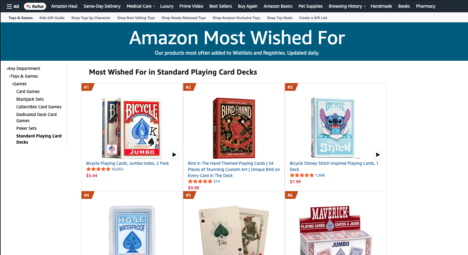
My proudest moment of the entire project was obviously overtaking Stitch in Amazon’s Most Wanted products.