Oregon State Parks Illustration Library
Client: Oregon State Parks Department
Work: Illustrations, icons, graphic assets, usage guide
I worked closely with the folks at Jolby to create a huge illustration and icon library for the Oregon State Parks Department. Spanning hundreds of graphic assets, including people, places, and things, this library is to be used by future ORPD designers and employees, making it easy to pull graphics from for usage in newsletters, flyers, website posts, and more.
The illustrations serve to promote the wide variety of scenery and activities available to anyone visiting one of the many parks in the beautiful state, with a fun and accessible aesthetic. The library was designed to be modular – assets can easily be mixed and matched and placed alongside each other, making it convenient for future users of the library to customize and have fun creating their own graphics.
A 100+ page usage guide was also created, listing all of the assets, going over the many different ways they can be used, and how to edit and create your own.
Colors & Style
A color palette was built expanding upon the ORPD current brand colors, using earthy and bold tones that mimic the nature that encompasses Oregon. Inside the guide are tips for how to best use the colors.
The style of the illustrations are warm, friendly, and welcoming to all, with a simplified and geometric look. The usage guide goes in depth on the specifics of the style and construction, like when to use round and sharp corners.
A big part of the library is a wide range of nearly 50 activity icons depicting people of diverse ages and backgrounds. Simple, geometric, and easily customizable, the icons can be used on their own or placed into larger scenes, showcasing all of the things parkgoers can do in Oregon.
Activity icons can be easily placed contextually into mini scenes.
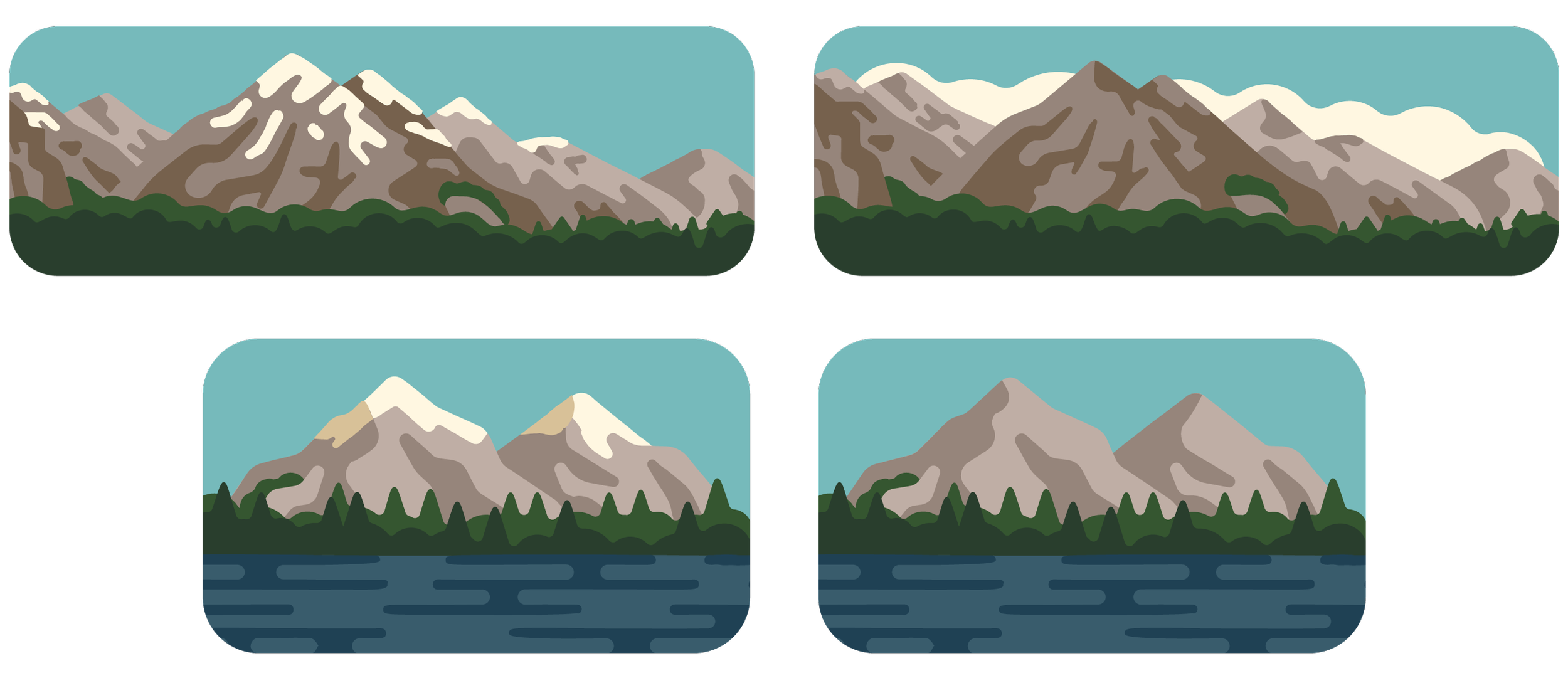
Crucial to the entire library was the creation of over a dozen scenic landscapes representing the diverse biomes of Oregon. These compositions are how many of the individual assets come together in their final form. They can be used in full, have other icons placed inside of them, be cropped for smaller illustrations, and more. Thorough guidelines were provided for how to edit existing scenes and create one from scratch. Each landscape needed to be generic enough to be reminiscent of Oregon, but not any specific location.
Detailed instructions on creating one’s own scene are included in the guide, from starting with a primary icon to surrounding it with vegetation and more. The assets can generally be shown from two perspectives – a flat plane view; and a top down view where the icons extend below the plane.
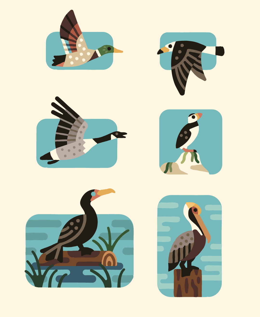
To showcase the diverse range of fauna found in Oregon, animals are geometric, with easily recognizable silhouettes, and show off their personalities. They are also designed to be scalable – featuring a “hero” version that’s larger and more detailed, and an “icon” version that’s simplified and can be surrounded by other graphics and presented in a variety of ways.
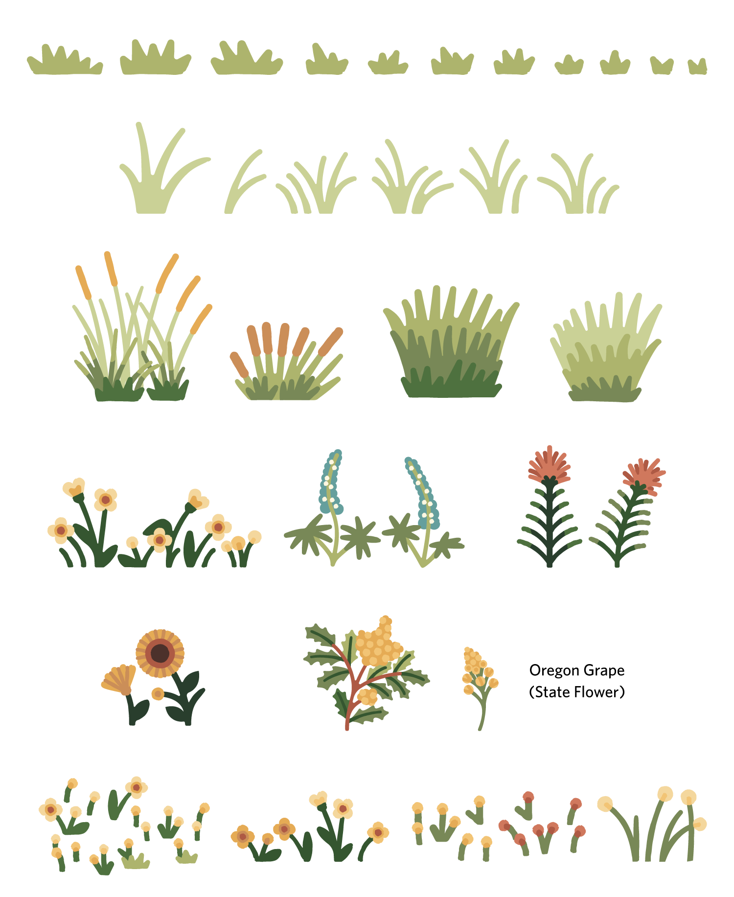
Flora help to contextualize the other assets and give added visual interest. Some are simpler, and some are more detailed to serve as foreground elements, and are extremely customizable depending on the season.
Over a dozen important facilities, from visitor centers to kiosks, were created to help parkgoers find their way. Like other aspects of the library, these are scalable, with both full and icon versions available.
From bicycles and chairs to signage and vehicles, objects generally have two functions – to add context to scenes surrounded by other assets, and to live on their own as standalone icons.
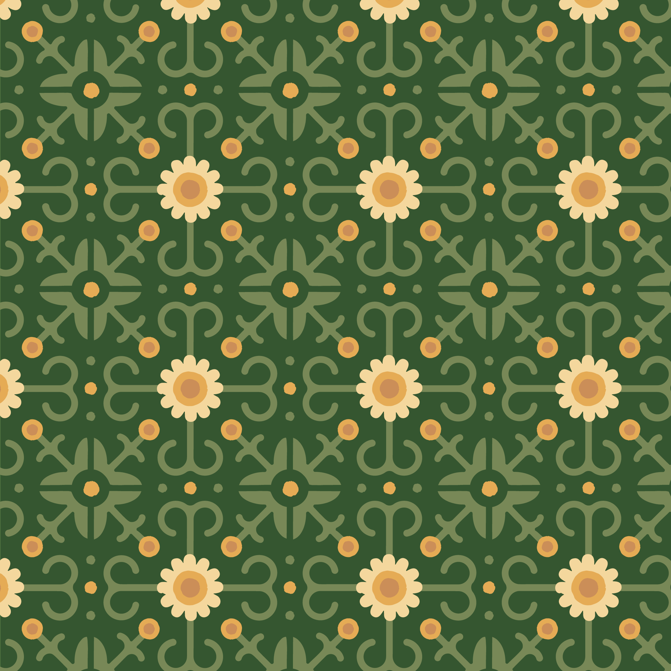
Over 25 patterns were created, including simple ones with shapes and more complex ones featuring repeating icons. These make for great backgrounds on flyers or ways to fill up spaces while still representing the ORPD brand.
Use Cases
A few examples of how the library can be applied to the brand.
Sketches
Like any project, each asset would start as a sketch to get the client’s approval on poses and accurate representations, using reference photos gathered by the Parks team. They would often involve rough color sketches as well to provide a better look at how they would look once finalized.
