Rochester Sports Retro Rebrand
Work: Branding, illustration, uniform design
Growing up in in a minor-league town like Rochester, New York meant going to lots of games as a kid. Our team’s identities are all over the place though, and I sought out a way to streamline five of the team’s brands into one cohesive Flower City identity, with a mid-century retro twist.
Rochester Red Wings
The Red Wings are the oldest continuously operated non-major sports team in America, since the turn of the 19th century, so I wanted to give them a timeless look that focused on the color in their name - RED. No more black, which they introduced in the 90’s and have made a core color in their identity.
The profile flying wing and ball logo takes inspiration from an early flying ball logo in their history, while the double wings logo draws from the iconic Times Square Building overlooking downtown and their ballpark, with its art-deco "Wings of Progress."
Rochester Rattlers
The Rochester Rattlers started in 2001 as a charter member of Major League Lacrosse and operated on and off until 2017, and they now play as the Dallas Rattlers (shame, I grew up reading about them in the papers! Never went to a game though).
I know very little about lacrosse, but the sport has lots of roots in Western New York dating back to the Indigenous population and is still extremely popular there.
The black and orange are used exclusively, with several different variations of the rattlesnake building out a brand asset library. We may not have rattlers in New York, but we love alliteration!
Rochester Raging Rhinos
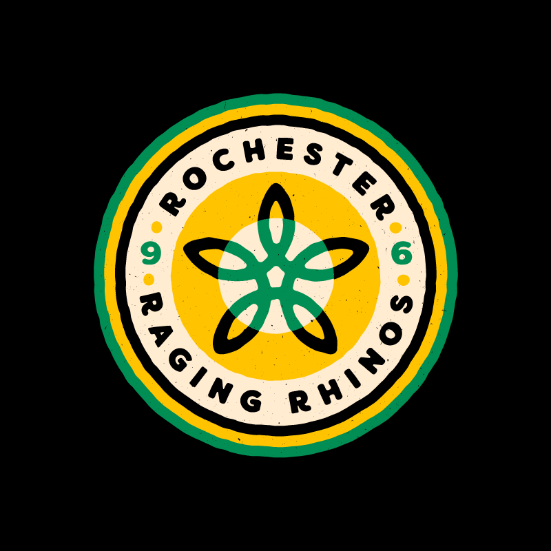
My favorite team growing up, the Raging Rhinos. Back in the late 90's, they were THE team in Rochester. They dominated their league and in '99 became the first and still only non-major team to win the US Open Cup, a tournament including all professional soccer teams in America (represented by a star above the crest here).
Sadly the team has gone through lots of ownership and financial issues, as well as a typical soccer-in-America crisis of identity. They dropped the "Raging" from the name in 2008, then completely rebranded in 2017 as Rochester NYFC under a new ownership group led by Premier League player Jamie Vardy, effectively killing the Rhinos for good.
Rochester Americans
The Americans (or Amerks) are one of the most storied franchises in the AHL, and still quite popular in Rochester. Their look has hardly changed since their founding in 1956, so this set strays the least from their current brand out of this whole project.
The primary is still an Americans script in front of a badge, while the secondary would be two hockey sticks that both form an "A" and the top of a star, taking advantage of a short-lived alternate logo they used for one year in the 70's.
The Flower City badge, like the rest in this set, represents Rochester's nickname of the Flower City (and the backing flower looks most like the city of Rochester logo out of anything in this project), with a little puck in the middle.
Rochester Knighthawks
An indoor lacrosse team (yes Rochester had two!), the 'hawks were quite popular in the city and did quite well in their league. I leaned more heavily into the purple with this set, and creating a retro, abstract monoline primary logo based off of their original diagonal swooping bird logo. Really played with the Knight theme as well as the Hawk name - it's a great name for a team!
Little Player Cards
Some playing card illustrations of little players modeling the brand and uniform.


